12.24.2009

The Beginning of my Idea...

These are about 3.75' x 5'.  The spontaneous drawings from my sketchbook seemed the most natural to me, the intuitive marks were honest and connected to what I was thinking and feeling in that moment.  These three drawings stand as research, a process of exploring my options, in order to get a feel for what it is that really drives me to create.


Here is a detail of the above drawing:


The marks are a way for me to "write" down what I'm feeling at a much more rapid pace in order to accurately capture my mood in its entirety.


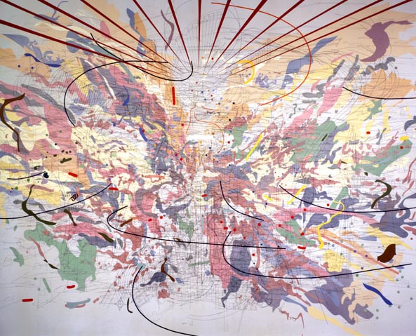
I was experimenting with various frameworks, different compositional layouts so that I can observe how my marks in turn react to the structure.  If the structure changes, I noticed that the marks began to behave differently.  I love seeing structure and order in the seemingly chaotic world we live in.


Here I introduced a little bit of color and the dotted lines.  Color is subtle yet bold on its own.  When found within the context of the various marks, it becomes muted, and almost unnoticeable.  The dotted lines signify various connections made during the process of journaling, or within one's daily routine.

Here's a detail of the above:


This is the first time I've ever posted my work on the web.  I feel a bit vulnerable, but recently I've been asked many times if I have a website of my work yet.  It is in the making, so I will use Pineapple Soju as a place to gently introduce my work to those around me.

11.25.2009

Style vs. Drive

Here is an artist who deals with large scale, expressive brush-strokes installations. It's pretty amazing, and the thing that kills me the most is just how SIMPLE her idea is.

As my wise uncle in Hawaii would say... "Who would'a thunk it~!?"

Here are some images of Sun Kwak's work:


And it's all done with masking tape.  Simply amazing.

I mention her because I believe my work is similar in addressing the cultural significance of the gestural brushstroke of calligraphy.  I have been searching for artists who work within a similar cultural context as I do.  The scale of Kwak's installations is inspiring me to work much larger, but I do not have the space for it.  Also, the difference is that my work is not installation; they are all drawings on paper.

Soon enough, as I develop a strong and coherent body of work, I will post images of my own drawings.  The direction it has taken is quite interesting and addicting in the sense that I wish to devote more and more time towards its development.


11.17.2009

Glorified Uncertainty

From Gerhard Richter's note from 1966...

I pursue no objectives, no system, no tendency;
I have no programme, no style, no direction.
I have no time for specialised concerns,
working themes, or variations that lead to mastery.
I steer clear of definitions. I don’t know what I want.
I am inconsistent, non-committal, passive;
I like the indefinite, the boundless; I like continual uncertainty.

(yet he has committed, persevered, produced, and mastered)

Back to writing about the critical reception of his work in the 80s... sigh.


Wolke Cloud 1976


Ema (Nude on Staircase) 1966


Gilbert & George 1975


Fikcion 1975


Overpainted Photos

Gerhard Richter Quotes

Quotes -"Gerhard Richter: The Daily Practice of Painting, Writing from 1962 - 1993"

--The idea that art copies nature is a fatal misconception. Art has always operated against nature and for reason.

--All we can represent is an analogy, which stands for the invisible but is not it.
To believe, one must have lost God; to paint, one must have lost art.

--I prefer the 'naive' photograph, with a simple, uncomplicated composition. That's why I like the Mona Lisa so much; there's nothing to her.

--Being able to do something is never an adequate reason for doing it.

--Theory has nothing to do with a work of art. Pictures which are interpretable, and which contain a meaning, are bad pictures ... It [making good pictures] demonstrates the endless multiplicity of aspects, it takes away our certainty, because it deprives a thing of its meaning and its name.

--Talk about painting: there's no point. By conveying a thing through the medium of language, you change it. You construct qualities that can be said, and you leave out the ones that can't be said but are always the most important.

--Now that there are no priests or philosophers left, artists are the most important people in the world.

--I do know that painting is not without an effect -- I only want it to have more of one.

--Painting is total idiocy. [On why he continues painting, despite lack of effect]

--Not bankruptcy, but always inadequacy. [On the limits of painting]

--Surely you don't think that a stupid demonstration of brushwork, or of the rhetoric of painting and its elements, could ever achieve anything, say anything, express any longing.

Reading thoughts of famous artists somehow makes them seem more human. I think the idea of a successful artist is not the fact that one painting sells for $13 million or more, but that he or she has found a way to achieve a level of insanity and obsession with the creative process.

10.11.2009

Origami Craze

Here are a couple cool origami links that are super cool to look at...

Origami In the Pursuit of Perfection by Mabona Origami - Watch the video, it's a stop motion animation with origami.  It's beautiful.


The coolest tea bag ever :)

I also really enjoy Brody Neuenschwander's calligraphic qualities.  He is a recent inspiration for me as well.  The line quality, integrated within the composition is beautiful.


As a growing artist, I realize that there were numerous projects completed in the past that were derived from an interesting concept.  What I realize today is that often times these works were mere introductions to the specific idea.  One ongoing subject matter that I was drawn to in high school was the art of origami and its cultural significance in Asia.  I created several works of art based on the visual aesthetic of origami cranes or turtles, incorporating its geometric interpretations of organic forms in nature. 
More recently, I developed a style of gestural drawing that felt so natural to me.  It was as if I were “writing” in my own language, similar to the spontaneity of written streams of consciousness.  In this process, I identify my marks with various forms of calligraphy, where the line quality expresses just as much as, if not more than, the literal meaning behind the written words. 
As a result of these observations, I began my research into origami and calligraphy.  Two artists have inspired me to explore these topics in greater depth.  First is Julie Mehretu, who is an Ethiopian-born artist who resides in New York.  I feel a strong connection to her style of drawing and the way she creates a whole new universe within a single canvas by utilizing truly dynamic compositions on a large scale.  She critically examines existing social structures that are potentially and historically detrimental to humanity, yet some of her drawings maintain a delicate quality that mimics calligraphy that evoke feelings of freedom.


 The second artist who inspires me is an origami artist named Peter Engel.  I stumbled upon his book in the bookstore and was immediately fascinated by his unique passion for origami.  Although he is currently an architect, his love for origami’s philosophy and practice is genuine and inspirational.  His explanation of how closely related nature and mathematics are has led me to a new level of understanding in the topic of origami. 
My work has now begun the process of uniting and exploring the relationship between structure and nature, which many times are found in each other as well as on opposite ends of the perceived spectrum.  I intend on reconciling the natural style of drawing with the geometric structure of origami with pen and ink on paper as my medium of choice.  Once I begin to gather how the two elements interact, I will then investigate how to push the idea further, producing a coherent body of work that showcases the visual development of the initial relationship. 


9.19.2009

Collaborative Mural in Nicoya, Costa Rica July/Aug 2009

My trip to Costa Rica this summer was a blast. The highlight of the trip was being able to participate in this opportunity to create a series of murals with my classmates and local Costa Rican art students. We completed a total of four murals at Universidad Nacional's satellite campus in Nicoya, Guanacaste. I worked with Alison, Ivannia, and Natalia on one of the four murals.


As guests to Costa Rica, Alison Hamil and I found it necessary to implement conceptual references that are meaningful to Costa Ricans, and to evoke feelings of familiarity and personal identification. With the help of two Costa Rican art students, the group was able to decide on a specific approach.

The floral designs in the mural were derived from a typical Costa Rican style of painting found on wagons. The color scheme and the symmetry within the design are very similar to this style of painting.

The Pre-Columbian images serve as a reminder to all that there was indeed a rich culture before colonization. Each stylized animal represents a belief of that culture. For example, the serpent signifies a seasonal change from winter to summer.

Although the design has historical references, as contemporary artists, the final product is very much a modern interpretation of its cultural and historical significance. After being exposed to the culture and learning of Costa Rica’s struggle to maintain its rich ecosystem in the midst of globalization and modern techonology, Alison and I realized how important it is to preserve the culture’s traditions in the mural, rather than introducing a foreign visual language from the United States. Just as Costa Rica continues to find its balance between cultural modernization and historical and/or natural preservation, the mural was designed with the same goals in mind, to ultimately mark the beginning of a new relationship between Georgia State University and Costa Rica’s Universidad Nacional.

Ivannia and Alison began to paint after projecting our designs onto the wall.

The texture on the pre-Columbian images were created with Costa Rican earth mixed into the acrylic paints.

After 12 hour days painting in the scorching heat, sweating non-stop, we finished the mural.

Here is a glimpse of what the other three murals look like.

8.31.2009

My Feet Were In Costa Rica

I've been back from Costa Rica for about three weeks now, and I am finally beginning to process through all that I consumed through my senses--it was a major sensory overload. Photographs are the best souvenirs because they each remind me of what my other four senses were doing, and now that I've had the chance to readjust myself to my comfort culture, I can begin to share specifically on how the trip influenced me.

Looking through my 900 pictures or so, I noticed my tendency to take a picture of my feet in context of where I was at that moment. Everywhere I went, I would look(or stare) at all the people, the buildings, the sky, the streets, the cars, the mountains, the gardens... everything. Although I didn't really hold back when it came to taking pictures of everything I saw, there was something reassuring and "grounding" for me to identify where my feet actually were at that very moment in time. Perhaps it was a way for me to recognize the reality of it all, that it wasn't some kind of fleeting dream. I really did go to Costa Rica and witness a culture that celebrates life in its society and in nature.